Blogs

September 26, 2016

Prototyping for apps

Posted by: {authorName}


Prototyping in design is making waves. With the advent of different app designs, its really important to do it to get to the right flow of things.

Wireframing, as it it sometimes called, has always been an integral part in developing apps. It has become the standard in designing almost everything. It is the first step, the key to it all, the stuff that will make things right. In the early design phase of a project, it is a good shield against making mistakes throughout the entire process of a project.

Architects, designers and craftsmen have used prototyping for ever. It is a very good practice that designers should comply with. It will make the process of developing apps easier. It is also a discipline that needs to be observed and harnessed, despite sometimes seeming like too much work.

"Do I really need a prototype? Can’t I just describe my app idea? Why is a prototype a necessary step when scoping a project?”

Clients ask these sorts of questions daily. But they hardly ever "get" the scope until they "see" it. According to research, more than 65% of the world’s population are visual learners. The use of a visual aid will help others process and understand your app idea.

The quality of your prototype will depend on your audience. Are you building an internal prototype that only your team members will see? Are you ready to start user testing? Do you need to pitch your app idea to raise funds? The level of fidelity is entirely dependent on who will be interacting with the prototype and for what purpose.

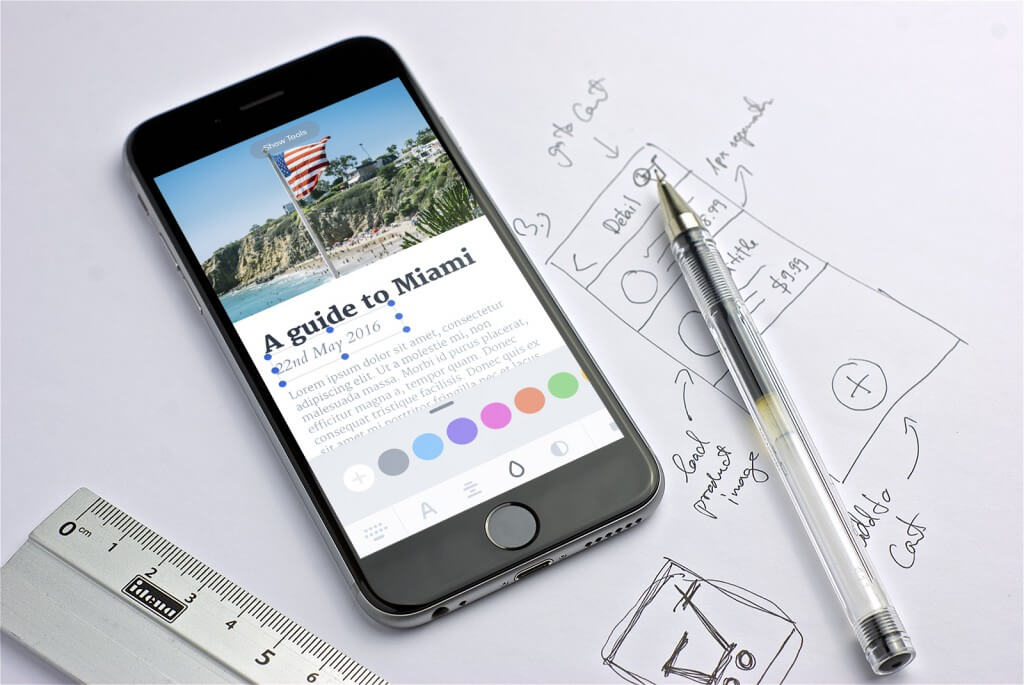
There are 3 types of prototypes: Low-fidelity (hand drawn sketch), Medium-fidelity (bare bones wireframe), and High-fidelity prototype.


Low-fidelity Prototype

It is for internal use, a hand-drawn wireframe is a great place to start. Quick iterations on the design will allow designers to gain valuable feedback from clients early on in the design process.

What matters is that the creative team have a solid understanding of the app’s functionality and how a user will interact with the app. As the project evolves, developers can add more detail, fill in with real data, and eventually make the prototype functional.


Medium-fidelity Prototype


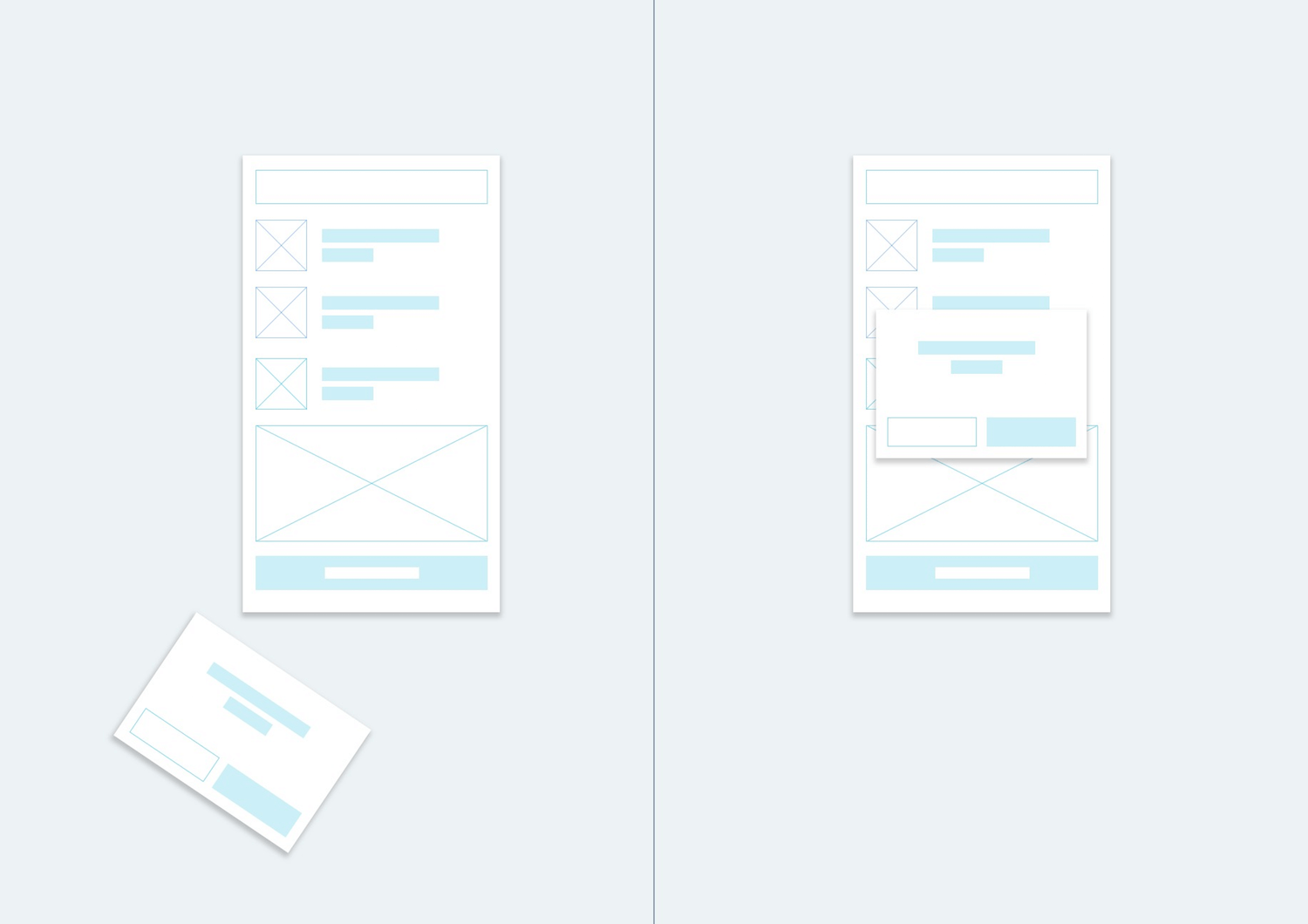
Practicality and usability of the prototype is the designer's main focus here. While the visual design begins to come into play more at this stage, the validation of the app's function is the focal point of user testing.

Putting visual elements but minimal design is perfect as Medium-fidelity prototypes. This is also the where people internally can give more detailed feedback on the functionality and usability of the project.


High-fidelity Prototype

This is the more polished presentation.

A high-fidelity prototype will be a far more professional version than a hand-drawn sketch.

A high-fidelity app doesn’t mean that you have to have every screen prepared. Focus on the most important screens within the app, like user logins and or creating profiles, and the look of the app icon.

Focusing on these key elements will help you provide a clear overview of the app while still allowing for further development.

September 26, 2011

Beautiful fonts for the web

Posted by: {authorName}

Before wide browser support for the CSS @font-face rule, web pages were limited to “browser safe fonts”. This meant the designer was constrained to using fonts that were available on every visitor’s machine. @font-face allows a web designer to make typeface decisions based on aesthetics rather than availability.

All modern browsers now support web fonts, in some form. Microsoft Internet Explorer has supported @font-face since 1997 in version 4, Apple Safari implemented support in 2008 in version 3.1, Mozilla Firefox added support in 2009 in version 3.5, and Google Chrome added support in 2010 in version 6.

When using @font-face you need to be aware of supported font formats and browser specific syntax.  There is currently no universally supported web font format. Failing to provide proper font formats and browser supported CSS will result in your page rendering inconsistently across browsers.  If done incorrectly, visitors will see the browser’s default font instead of the specified font.

There are some great font services that take care of cross browser support by dynamically generating the appropriate CSS for each browser.

Typekit, Webtype, WebINK, and Fonts.com are some of the services available, and all of them generally take care of hosting and licensing. Using one of these services allows the quickest path to implementation without having to know too much about the underlying technology.

Typekit provides many fonts created by Adobe, and we are working together to offer more Adobe fonts in the future.

Then there's Google fonts. The fonts will be generated by Google by accessing their servers, it will just take a couple of niffy jiffy on the doctype to use it, and its all for free.

If you find yourself needing to roll your own web fonts, there are a few basics that are required to ensure your intended fonts show up on all browsers:

Know your font formats. There are a few different versions of web fonts in use today.

Embedded OpenType (.eot) – Supported by Internet Explorer only.TrueType/OpenType (.ttf/.otf) – Supported by the widest range of browsers, but, not supported in Internet Explorer. (this may change in IE9)Web Open Font Format  (.woff) – Supported in recent versions of Chrome, Firefox and Internet Explorer, but not yet supported in Safari.In addition to needing to worry about licenses and multiple font formats, browsers interpret CSS code differently, so writing a rule to include your fonts is less than straightforward. “Bulletproof” syntax for @font-face has evolved over the years to work around browser inconsistencies. Much of the syntax seems repetitive and counter intuitive. For a good history of @font-face and a clear explanation of the CSS syntax read the ”The New Bulletproof @Font-Face Syntax” blog post at Fontspring. Learning how the syntax has evolved gives a clearer picture of how each browser handles @font-face.

FontSquirrel is a web service that will convert fonts for you and generate CSS code.  After uploading your fonts, FontSquirrel will convert your fonts for cross browser usage and generate CSS for you. The CSS code generated by FontSquirrel also happens to work just about everywhere, including mobile devices. If you use FontSquirrel to generate web fonts, make sure you have the proper license to do so.

Now, websites will be magazine-likes, having the best and nicest fonts out there and having the liberty to use all existing fonts for the web is truly outstanding and great news for designers as well.

Posted by: SEO Specialist

Do you want to know why some online business are failing, especially new businesses? It's simple really; they are making small mistakes that is having a massive effect on the traffic to their website.

1. IT'S NOT A RACE - If you have a business or a web idea that you want to promote online . . . DO NOT HURRY to develop it. The most effective and useful websites on the internet have taken weeks, months, even years to develop and perfect!

If you rush, you will miss things! - Take the extra week, research your competitors, see how you can beat them with your website, come up with new ideas, do something differnt!

By taking the extra time, you can ensure that you have covered all aspects of your business and how you are going to promote it on the web successfully.


2. WHERE ON EARTH DO I GO? - There is NOTHING WORSE than visiting a website and you can't find the menu. It's hidden, it's flash animated, it doesn't work properly or it's even written in another language to be arty!

If you create a website with poor navigation, you can bet that users will spend an average 2 seconds on your website - and they will be spending that time trying to locate the back button on their browser!

Make your navigation clear, crisp and precise so that users can easily navigate around and find the info they need. By doing this they will stay on your website longer which can lead to future enquires for you business.

Try it out! What you think might be a good idea for navigation could be horrible for someone else. Why? Because you know how the menu will work in your head and other people would have no clue.


3. IT IS A MESS! - So you have 6 different columns, 5 different images, moving pictures and a nice big pop up banner and it's all on the one page. . . where do you want me to look?

LOSE THE CLUTTER PEOPLE!!

Your website needs to have the MOST IMPORTANT information CLEARLY made available to maximise your potential business.

If I visit a website and there are 10 different calls to action, I leave straight away due to sheer confusion.

This is a massive flaw that people have with their websites. They think that the more information they have on the page the better - yes i'll give you credit that a lot of information can help, just not all on one page . . . spread it out.

And obviously people leaving your website is a bad thing. Not only will you have a high bounce rate, but you will more than likely find your website ranking will head down the google chain and struggle to boost itself up because no one is visiting it!

Just remember:

Put the most important and relative information on the page. Put yourself in your potential visitor's shoes. They know NOTHING about you or your services. If they were to visit your site, would they be able to pick up the services you offer nice and quick? This is imperative- Use images to illustrate a certain point and not just for decoration. Images form a large part of clutter so make sure they are only there if you need them!


4. It don't matter if it's Black or White . . . or red or yellow or green with a little purple . . .

Stop overdoing it on the colour . . . . The other day I visited a children's website and I swear it had every possible colour in the world on the one page. This is not good, not good at all.

When people think of colours, they think "I need to make it look pretty", but what you should be thinking is "how can I use colours to direct my users' attention".

By this, I mean that if you have a tagline, header, or something important you want to point out to the user, colour should be your first port of call as it's where people's attention is drawn to.

When it comes to colour also, you need to make sure your colours match and complement each other - and please MAKE SURE it matches your logo . . . I can't tell you how many times I have seen a website with a Logo that does not even match the website colours and it looks horrible. 

If you are stuck on colours, Google colour charts or colour themes make sure the colours you are using match, otherwise you will lose a visitor's attention.


There are many other small things that people do wrong on websites, what you need to do is plan it properly, use common sense and most of all make sure that the website is user friendly!

If you need some advice on optimising your website to ensure it reaches is maximum possibilities with your target market, please give KAYWEB a call on 1300 794 636 and we will be able to provide you with some advice.

Now go get planning!